Fair Doctors
Fairdoctors has commissioned us to completely redesign their corporate identity and website. We have created a new image that clearly distinguishes the various sub-brands from one another and at the same time creates a uniform appearance with a high recognition value for the entire brand.
Doctors for first-class medical care for all

This is how we were able to help
A fresh brand identity for Fair Doctors

A new corporate identity
Fair Doctors recognized that they needed to adapt their brand to remain competitive in the changing healthcare market. That's why they asked us to express their values and philosophy in a new brand identity. We have developed a holistic rebranding concept that not only reflects Fair Doctors' many years of experience and expertise, but also highlights their pioneering vision and mission of making world-class medical services accessible to all. The result is a brand that is both modern and authentic, and clearly demonstrates Fair Doctors' commitment to its patients.

A unique logo design
Our idea for the Fair Doctors logo is based on the well-known “Star of Life” symbol, which is recognized worldwide as a symbol of medical care and emergency services. We've created a modern version of this classic symbol that looks familiar and innovative at the same time. It perfectly reflects the medical areas, values and goals of Fair Doctors.
A consistent brand image
To make it easier for patients to differentiate between the various medical services offered by Fair Doctors, we have colored the sub-brands differently. Each sub-brand represents a medical sector of Fair Doctors, such as dentistry, pediatrics or general medicine. We have ensured that the brand image is consistent and thus ensured that every customer, regardless of the service chosen, always feels that they are communicating with the familiar and reliable brand Fair Doctors.

Distinctive colors
We've developed a new color palette for Fair Doctors that reflects Fair Doctors' values and vision and creates a consistent visual identity across all media and platforms. Whether on the website, in brochures or other advertising materials — the colors ensure a high level of recognition and convey trust and professionalism. This careful selection of colors supports identification with the brand and ensures that Fair Doctors remains present and unmistakable in patients' memories.


A new web design to match the new brand identity

New Homepage - Web Design
We have completely renewed the Fair Doctors web design in order to consistently present the new corporate identity on the homepage. As a result, we strengthen patients' trust and they recognize the brand better. We've also improved usability by clearly structuring the content so that patients can easily find what they're looking for.
Clear navigation
We've improved website navigation so that it provides visitors with more clarity and direction. This makes it easier for patients to find the medical services they're looking for and make an appointment quickly.

Perfect display on all devices
We have adapted the Fair Doctors web design for all common devices and made it available to developers. The responsive design gives users an optimal experience on smartphones and tablets and contributes to a professional appearance of the Fair Doctors brand on all devices.
Unique colors for all areas
We have developed our own color palette for all medical areas in which Fair Doctors offers care. In this way, patients can clearly differentiate between the different specialist areas and at the same time, the sub-brands fit harmoniously into the overall brand image of Fair Doctors.

Unique icons for intuitive user navigation
We have developed a unique icon palette for Fair Doctors, which includes many icons for the sub-brands. All icons fit perfectly into the new web design and intuitively guide users through the content offered, so that important information and services can be found faster and more efficiently.


Impress your customers with a strong brand
A strong brand is the key to winning new customers and retaining them with your company over the long term. We create a brand identity for you that is as unique as your company. Schedule your initial consultation today and get a non-binding offer to redesign your brand.

A modernized online presence for Fair Doctors


Take a look at more projects
European Speed Club®
For the European Speed Club, we developed a tailor-made Webflow solution with an integrated booking system, CRM synchronization and an interactive event calendar — a digital experience that combines passion for motorsport and technical perfection.
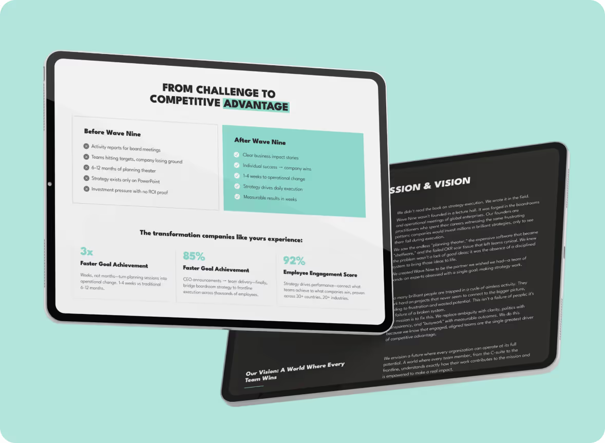
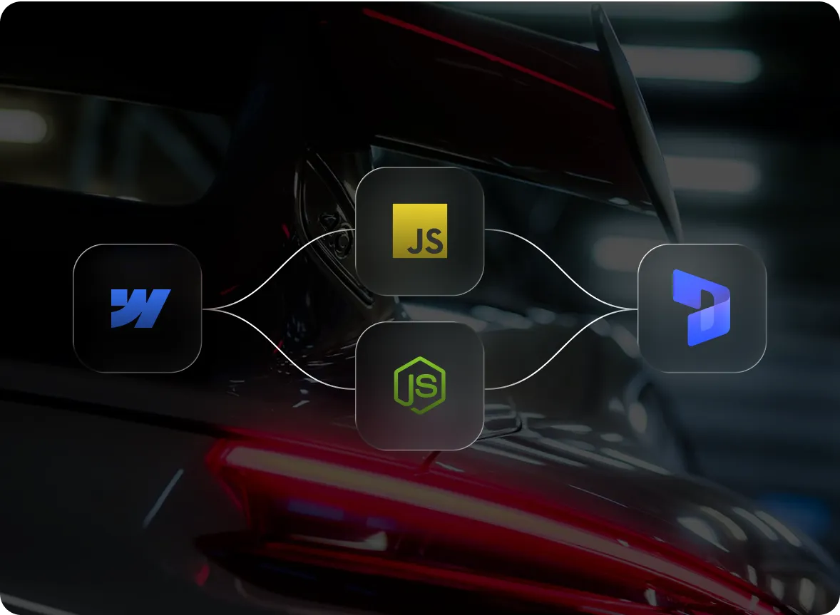
Wave Nine Inc
For Wave Nine, we developed a strategic B2B webflow platform that positions the company as a competent partner for OKR and strategy consulting. With a modern design, flexible CMS structure and targeted animations, the website strengthens brand authority, increases visibility and actively supports lead generation.
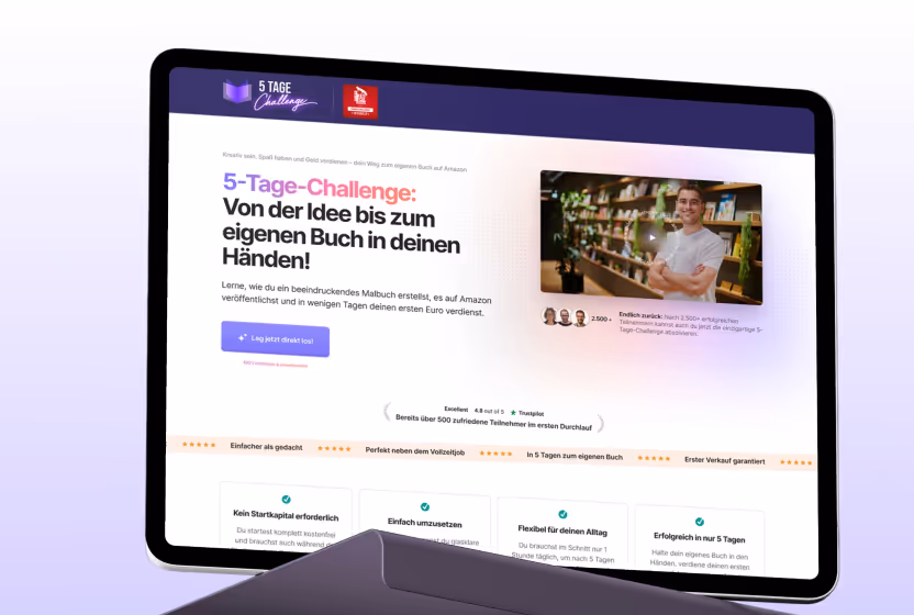
5-day challenge
For Nomad Publishing, we developed a modern, high-conversion webflow landing page with a strategic funnel structure. The relaunch replaced the old WordPress solution, increased reach and performance and led to over 5,000 registrations and more than 300 new customers.
Secoserv
Secoserv received a modern, high-conversion Webflow website, which serves as a central foundation for customer inquiries and recruiting. Thanks to a clear structure, SEO optimization and intelligent forms, the company is now visible, trustworthy and digitally scalable.
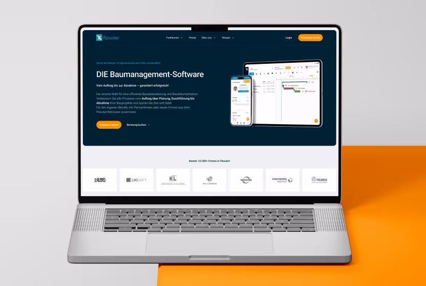
Flexxter®
For Flexxter, we implemented a quick, agile webflow relaunch based on MVP, which successfully replaced the outdated site in just four weeks. With a clear positioning of AI agents, a well-thought-out SEO strategy and structured content structure, the new website increases visibility, trust and sustainable lead generation.

Maria Hilf Hospital Warstein
Maria Hilf Warstein is a regional hospital providing primary and standard care. We developed a modern Webflow relaunch with a clear UX, confidence-building design and a focused career area for patients and applicants.
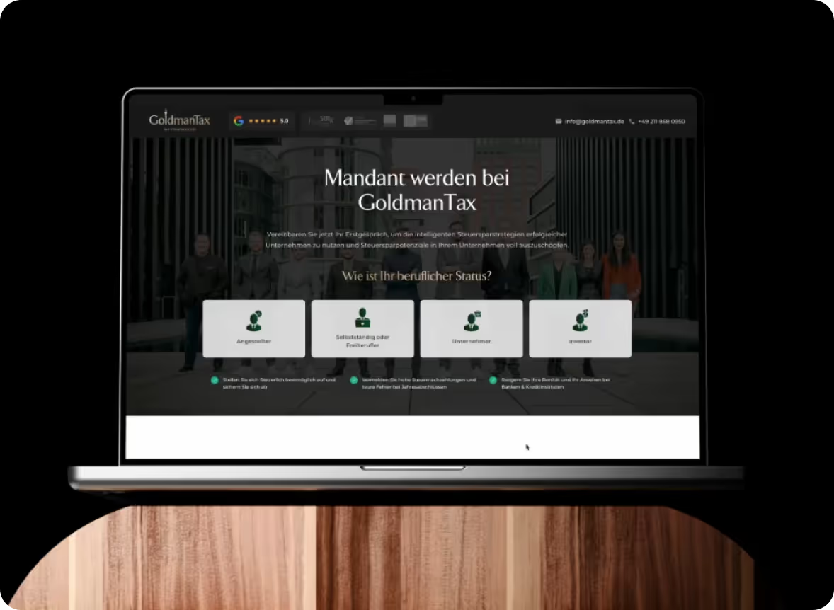
GoldmanTax®
Tax Law Reimagined: Eine digitale Plattform für die elitäre Steuerstrategie. Für GoldmanTax® haben wir den digitalen Auftritt einer High-End-Steuerkanzlei neu definiert. Durch progressives Design, subtile Animationen und einen hocheffizienten Qualifizierungs-Funnel („Potenzialanalyse“) entstand eine Plattform, die technologisch neue Standards in der Steuerberatung setzt.
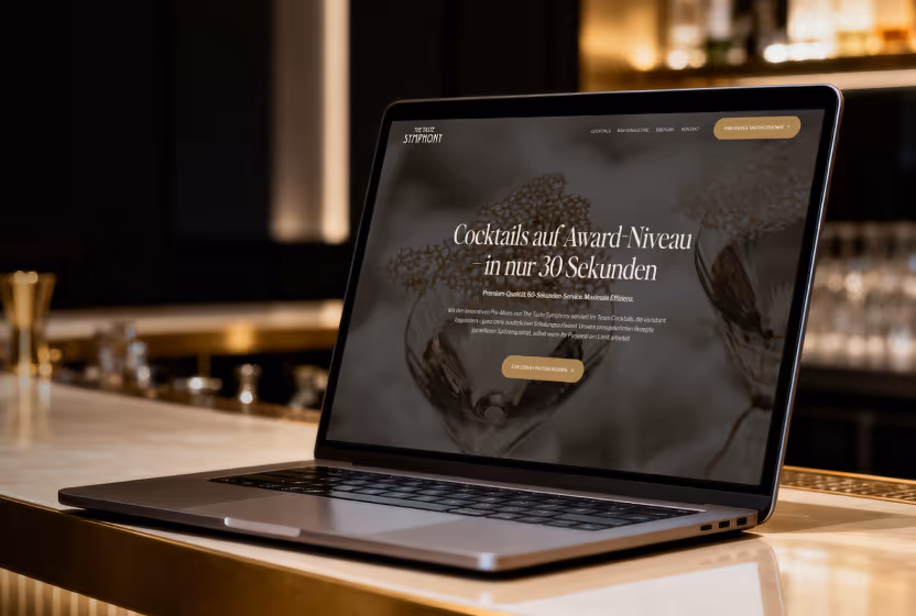
The Taste Symphony
The Taste Symphony is a premium B2B provider of pre-mixed cocktails.
We developed a clear, multilingual webflow platform with professional UX and a structured enquiry process — as a central sales tool for hotels, bars and caterers.
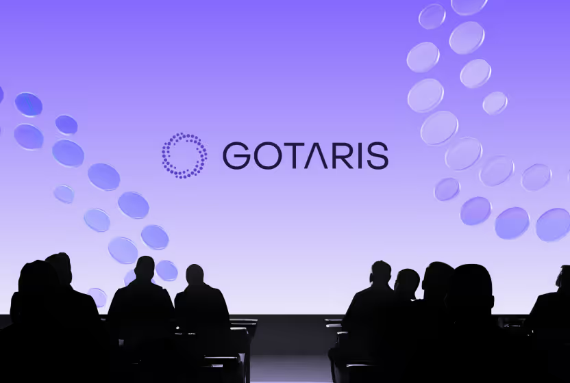
Gotaris
Gotaris is a data-based analysis platform for crypto investors. Gotaris is a data-based analysis platform for crypto investors. We developed a closed web app with subscription system, secure member area and interactive dashboard — a fully automated access to exclusive fundamental data for the DACH market.

Rohlmann tax advice
For many years, Rohlmann Steuerberatung has been the first choice for companies in the Rhine-Ruhr region when it comes to comprehensive financial support. From complex restructurings, family foundations to ongoing financial accounting, the company offers a wide range of services for tax optimization and implementation.
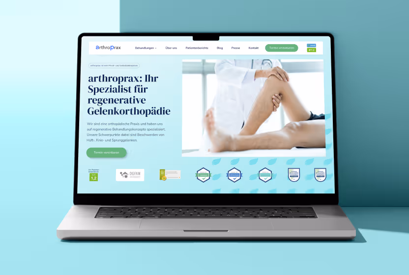
arthroprax
arthroprax is a specialized practice for regenerative joint orthopedics in Cologne.
We developed a multilingual webflow platform with SEO strategy, blog, press and video integration, which positions Dr. Olaf Beck as a leading expert and generates up to 200 qualified patient inquiries per month.
.avif)

Adeleon
Adeleon buys companies to secure the entrepreneurial heritage of the founders and to carry their values into a successful future. During the takeover, they ensure that the integrity and culture of the companies are maintained and ensure a smooth transition for all parties involved.


Markus Mensch
Markus Mensch is an experienced marketing consultant who makes companies of all sizes successful. His proven system, which he has developed over 10 years of successful practice, aims to increase the visibility of companies and increase sales.
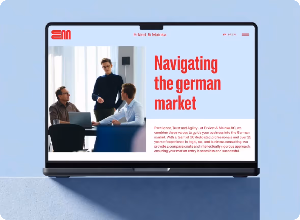
Erkiert & Mainka
For Erkiert & Mainka, we implemented an externally developed premium design in Webflow with pixel accuracy and combined it with a powerful CMS and a trilingual structure. Subtle GSAP animations, high performance and perfect technical implementation ensure an exclusive digital presence at C-level level.

Aedifion
aedifion: The pioneer for intelligent building optimization. aedifion is an innovative company that specializes in optimizing buildings in terms of sustainability, efficiency and transparency using its AI-based cloud platform.

Atfinity
Atfinity has developed an innovative no-code platform specifically designed to automate and optimize processes in banks and fintechs and ensure smooth interaction. Atfinity has already proven to be a reliable partner for numerous renowned financial institutions.

Jan Bahmann - Redesign
Jan Bahmann and his team are experts in the field of sustainable weight loss. With the MEA-3 method, they offer a solution suitable for everyday use for long-term results. It's not just about losing weight, but about developing and maintaining a new sense of life.

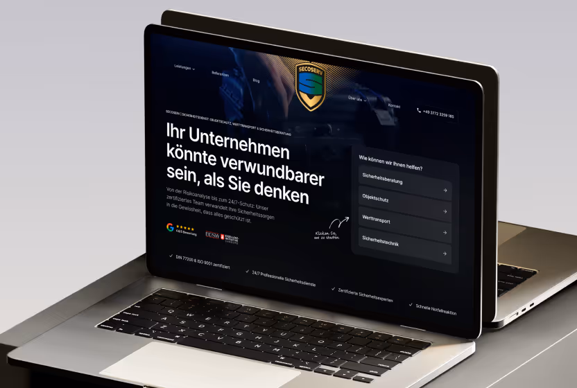
House for Security Berlin
For the company, we developed a new Webflow homepage that highlights the expertise and partnerships and thus positions the company as a professional provider of high-quality security technology for authorities, companies and private individuals.

Micro MIM Europe
Micro MIM is a Japanese company that has developed μ-MIM® technology for manufacturing microcomponents. We created a localized website for them to enter the European market that showcases their unique and innovative technology.

Amateur Chess Organization
ACO is a platform for amateur chess players from all over the world. We've created a four-language website using Webflow and Weglot in an elegant, chess-inspired design that focuses on the exciting events.

Persowave Recruitment
For Persowave, Germany's fastest recruitment agency, we created a new corporate identity, a suitable web design as well as a homepage and various landing pages for lead generation with Webflow.

Hübner & Partner Innovation
Klaus Hübner is an expert in funding management. Our Webflow website presents his offer clearly and comprehensibly in order to better address his target group so that Klaus can attract more new customers via his website.

Polarstar Real Estate
The leading real estate developer from Germany offers apartments in the luxurious Emperium residential complex on Golden Sands in Bulgaria. Using the specially developed Webflow landing page, we generate qualified leads with Google Ads.

Bevuta IT
bevuta IT is a leading software development company known for its passion for technology and many years of expertise in creating complex digital products. For over two decades, they have been a reliable partner for customers and have earned a reputation for innovative solutions that support people and drive digital transformation.

Barzegar green building
Grünbau Barzegar transforms gardens in Vienna and Lower Austria into oases of peace. We designed a modern Webflow website that presents the company as a reliable partner for gardening and landscaping projects.

Jan Bahmann
We have migrated the website of Jan, a well-known nutrition coach, from Wordpress to Webflow. The original design was recreated with pixel accuracy and search engine optimizations were carried out to secure its top position.

Westfa Holding
For WESTFA Holding, we developed a trilingual Webflow homepage that clearly conveys their brand message and acquisition process. The modern design highlights their professionalism and positions them as trusted buyers for companies.

Newboxes
With the aim of making companies future-proof, newboxes is at the forefront of disruptive change. With Webflow, we have implemented an innovative web design for newboxes, including dynamic animations and interactions.

IB Trader
Ivan, also known as IB Trader, is a successful trader and trading coach with a large community. We've created a Webflow homepage that highlights Ivan's authentic nature and personality and promotes his new masterclass.

Bindella
A Tuscan winery that has been owned by the family since 1983. Our Webflow website, with its stylish and themed design, underlines its tradition and allows visitors to book tasting packages in three languages thanks to Weglot.
Position Your Medical Excellence with a Strong Brand.
A modern healthcare market requires an identity that builds trust and convinces consistently across all channels. As seen with Fair Doctors, we develop a holistic rebranding for you that makes your values visible and intuitively guides patients to their appointments. Let's work together to create a brand that perfectly combines professionalism and accessibility.
