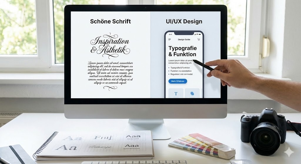
Typography in UI/UX Design: More Than Just Pretty Type
Short and concise
- The Problem: Many designs do not fail because of color, but because of text. Bad typography destroys the User Experience and trust in Your Brand.
- The Strategy: Choosing a typeface is not a matter of taste. It is a strategic decision that conveys emotions and functions.
- The Technique: Elements of typography like Line Height, Letter Spacing, and vertical rhythm are the invisible framework for Readability and aesthetics.
- The Solution: Use contrasts for a clear Visual Hierarchy and adhere to technical rules for Body Text.
- The Result: A professional interface that guides users intuitively and makes content easy to consume.
The Starting Point: 90% of the Web is Text
Have you ever wondered why some User Interfaces immediately look professional while others look "cobbled together"?
The answer often lies not in the images.
It lies in the text.
Whoever does not master Typography in UI UX Design, does not master web design.
Yet reality often looks different.
Many designers – from Junior to Middle Level – select fonts based on "feeling".
The result is layouts that are hard to read and confuse the user.In this article, we will show you how to use Typography in UI strategically to avoid errors and guarantee a good Design – regardless of short-lived trends.
Step 1: Strategic Font Choice Instead of Random Selection

The biggest mistake often happens before Figma is even opened.
A font is chosen simply because it is currently "in".
But Typography is communication, not decoration.
Before you choose a typeface, you must clarify four questions:
- What emotion should be conveyed? Serious or playful?
- Which era is being cited? Classic or futuristic?
- What is it about? Does the font fit the Content?
- What is the Function? Is it about readability or show?
A UI Designer knows: The use of the right Font Family determines whether a user trusts or bounces.
For example: For a fintech product, you use clean Sans Serif Fonts to signal clarity.
For a bakery, perhaps a warm Serif font.
Step 2: Contrast and Hierarchy – Guide the Eye
One of the most important Principles of Typography is contrast.
It creates Visual Hierarchy.
The basic rule is simple: High contrast draws attention (Headlines), low contrast provides information (Body text).#If everything on your
If everything on your Web Page looks equally important, nothing is important.
Use Font Sizes, Font Weights, and colors purposefully.
It's important to understand that the user scans the page.
A clear hierarchy makes it easy for them to grasp the structure of the text.
Step 3: Technical Readability – The Invisible Rules

Have you ever read a text that ran across the full width of your monitor?
That is exhausting.
This is where Elements such as line length and spacing come into play.
The Optimal Line Length
The rule of thumb for Text on a screen: 6-7 words per line are ideal.
Anything beyond that tires the eye (Eye Tracking).
Use Whitespace to limit the text and sharpen the focus.
Line Height and Letter Spacing
The distance between lines (Line Spacing or Line Height) is crucial for the Body Text.
If it is too tight, lines stick together.
If it is too wide, the eye loses the line.
Letter Spacing must also be correct.
Especially for headlines in ALL CAPS, you should slightly increase the spacing to make it readable.
Step 4: The Vertical Rhythm
An often forgotten secret in Product Design is the Vertical Rhythm.
Many place text blocks arbitrarily.
But professional UI Design follows a grid.
Define a fixed set of styles:
- 3-4 Headline variants (Font Style)
- 2-3 Text variants
Keep the spacing consistent.
This subconsciously creates order and harmony in the interface.
Step 5: Accessibility – Design for Everyone
Good design excludes no one.
Typography in UI must be accessible.
Pay strict attention to sufficient contrasts between text and background.
Use tools to ensure your design complies with WCAG guidelines.
Another pro tip: Use relative units like rem instead of fixed px.
This allows the user to scale Font Sizes in browser settings themselves without destroying the layout.
To ensure Accessibility is not a bonus, but a standard.
Step 6: Font Pairing – The Art of Combination
Less is often more.
A common mistake in UX Design is using too many different fonts.
Limit yourself to maximum two Typefaces.
A proven method is the combination of a distinctive font for Headlines (e.g., Serif) and a highly readable Sans Serif Font for the Body Text.
This creates tension in the interface without disturbing the harmony.
Ensure that the chosen fonts match visually or create a deliberate contrast.
Step 7: Responsive Typography – Fluidity on All Screens
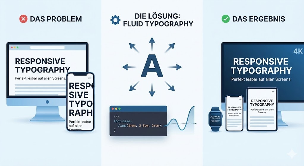
Web design is not static.
Typography in UI must adapt.
A common problem: Text that looks good on desktop overwhelms on a smartphone.
Or vice versa: Tiny text on large monitors.
The solution is Fluid Typography.
Use modern CSS functions like clamp() to scale Font Sizes dynamically.
This ensures your Content remains perfectly readable on every device – from smartwatch to 4K screen.
Step 8: Micro-Typography – The Devil is in the Details
This is where the wheat separates from the chaff.
While Macro-Typography (Layout, Hierarchy) forms the framework, Micro-Typography provides the finishing touches.
Pay attention to correct quotation marks (Smart Quotes instead of "inch marks").
Use the correct dash (En-Dash) instead of the hyphen when appropriate.
Pay attention to ligatures and Letter Spacing on capital letters.
These details may not be consciously noticed by the user, but they generate a feeling of quality and care in your Product Design.
How Pros Work: Workflow and Tools
You don't have to reinvent the wheel.
One of the best ways to get a strong feel for typography is Benchmarking.
Analyze successful projects.
How do other designers solve the problem of text and image?
Use tools in Figma to check grids.
Break rules only once you have understood them.
The Art of Typography lies in knowing rules and then using them purposefully to create tension.
Text is the Interface
Typography in UI Design is the backbone of your digital product.
Whoever masters font choice, contrast, and rhythm immediately lifts their design to a new level.
It is about making Content accessible and creating User Interfaces that bring joy.
Take a look at your current project.
Check the line length.
Adjust the X Height.
Increase the contrast.
Small changes, big impact for your User Experience.
Do you want to ensure your website not only looks good but also performs?
Let's talk.
FAQ
What are the most important Elements of Typography?
These include Line Height, Letter Spacing, Font Sizes, Font Family, Font Style, and the X Height. The interaction of these elements determines how easy to read a text is.
Why is Typography important for UX?
The importance of Typography lies in the fact that text carries the majority of information on the web. Good typography guides the user (Text Alignment), improves readability, and strengthens Your Brand.
What is the difference between Typeface and Font?
Technically speaking: A typeface is the design (e.g., Helvetica), while a font is the digital file (e.g., Helvetica Bold 12px). In daily UX UI Design, the terms are often used interchangeably (known as the same).
What is typography?
Typography refers to the art and technique of arranging type to make written language legible, readable, and appealing. It involves selecting Typefaces and Fonts, point sizes, line lengths, and spacing (Line Spacing).


rev%20komprimiert.jpg)
.jpg)

.png)


.jpg)
.jpg)


