

Glossary: UI Design (User Interface Design)
UI design, or user interface design, is the process of shaping every visual and interactive element a user sees and touches in a digital product. It covers typography, color, spacing, icons, buttons, input fields, and the visual states each component holds as users interact with it. UI design works alongside user experience (UX) design, but the two address different layers of a product.
UI Design vs. UX Design
UX design addresses the structure and logic of a product: how it is organized, what tasks it must support, and where friction appears along a user's path. UI design is the visual execution layer built on top of that structure: how each element looks on screen, how it signals its purpose visually, and how it responds when a user interacts with it.
The clearest way to draw the boundary: UX asks "does this work for the user?" and UI asks "does it look consistent and communicate its state correctly?" A UX designer's output is wireframes, user flows, and information architecture. A UI designer's output is polished component specs, color tokens, and documented visual states. On most projects, the two disciplines inform each other closely, and many designers work across both. The article on UI/UX trends for 2025 and beyond covers how the relationship between the two is evolving in current practice.

What UI Design Covers
UI design operates across several interconnected layers of a digital product:
- Typography: type hierarchy, font selection, weight scales, and line length shape how quickly a user can scan a screen. Typography in digital products also requires careful attention to rendering across screen densities and operating systems.
- Color and contrast: color communicates state (error, success, disabled) as much as it communicates brand. Without a deliberate color system, state signals become inconsistent across screens.
- Components and states: a button is not a single asset. It has default, hover, focus, active, and disabled states. UI design defines and documents all of them.
- Spacing and layout: grids and spacing tokens keep screens visually coherent as a product scales to new content and new screen sizes.
- Design systems: a documented library of UI components with tokens for color, spacing, and typography, together with usage guidelines. A design system is a living artefact that prevents inconsistency from accumulating as development teams grow.

Application Example
Beispielszenario, keine echte Kundenzahl: A software company adds a support ticket form to its web application. The UX designer has specified three fields (issue type, description, file attachment), decided the form should open in a modal, and confirmed through user testing that the label "Send request" reads more clearly than "Submit." The UI designer's work begins from that specification: choosing the modal shadow and dimensions, the input field height and corner radius, the focus ring color and width, the error state treatment (red border, icon, and inline message in a consistent typeface), the button sizes, and the visual hierarchy between the primary submit action and the secondary cancel link. Each decision is documented so a developer can implement it consistently, and so the same component can be reused across other screens. Teams evaluating tooling for a new project will find that building a business website in Webflow shows directly how UI component specifications translate into a component-based build.
Why It Matters
Visual inconsistency erodes trust quickly. Users who encounter buttons that look inactive, error messages without clear guidance, or spacing that shifts unexpectedly between screens start to doubt a product's reliability, independent of how well the underlying system works. This applies to marketing websites and business applications in equal measure.
For companies commissioning a new site or digital tool, explicitly scoping UI decisions before development starts typically reduces revision cycles and prevents the patchwork styling that is costly to correct later. A team working from a defined component library can extend or update a product without rebuilding its visual logic from scratch. For teams comparing design and build platforms, the Framer vs. Webflow comparison shows how UI design decisions and component systems translate differently depending on the platform.
Tailored solutions
Discover selected topics and services related to web design, Webflow, and lead generation. Quickly find the right starting point for your next project.
Articles & Resources

ChatGPT Ads Agency: What We Learned From Over 200,000 Impressions

Google Core Update: How to Identify the Impact and Respond the Right Way
Marketing Attribution Models: Which Channel Really Brought the Lead?
Core Web Vitals: How to Improve LCP, INP, and CLS in Practice

Offline-Conversions und erweiterte Conversions: Google Ads mit echten Abschlüssen füttern

B2B Google Ads: The Most Common Mistakes and How to Stop Wasting Budget

Weglot and PHP2Shell: What Weglot Users Need to Check Now

Webflow and PHP2Shell: Why Webflow Websites Are Not Affected

PHP Security Vulnerability PHP2Shell: Why Hundreds of Websites Went Offline
SEO Freelancer or SEO Agency: Which One Fits Your Business?

AI SEO: What Really Changes With AI-Powered Search

Full Self-Driving as a team event: What Tesla’s AI teaches us about trust and innovation

How Long Does SEO Take? Realistic Timelines and What to Expect

Online Advertising: Channels, Costs and First Steps (2026 Overview)

Optimize Your Landing Page: More Enquiries from the Same Traffic

On-Page SEO: The Complete Guide to On-Page Optimization (with Checklist)

Integrating a CRM into your website - how it generates leads

Webflow websites for companies: Is it worth it in 2026?

How does a website win new customers?

Webflow CRM Integration: How We Connected Webflow with Microsoft Dynamics 365

SEO: What is Search Engine Optimization and How Does It Work?
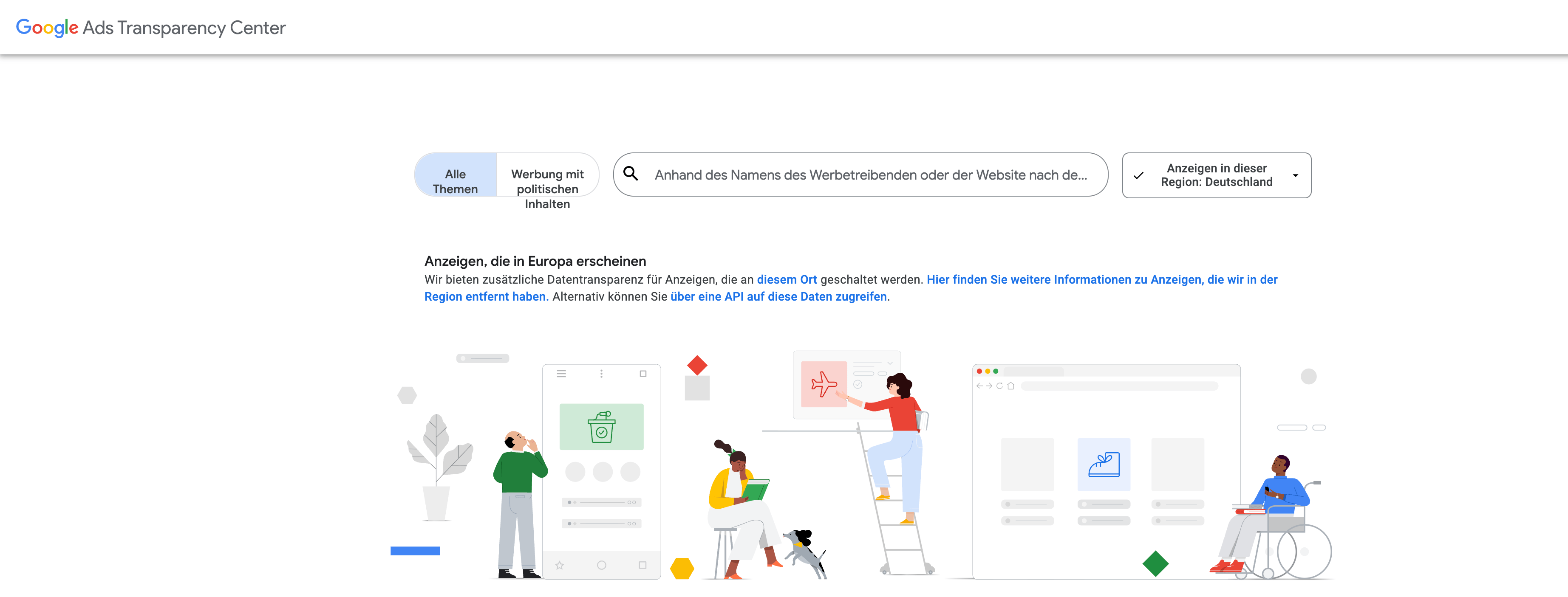
Google Ads Transparency Center
Framer vs. Webflow 2026: Which Website Builder Wins the Duel?

Typography in UI/UX Design: More Than Just Pretty Type
UI/UX Trends 2025: What Companies Need to Know Now to Stay Relevant

From WordPress to Webflow — How ACO left its “update hell” and became a premium brand

The future is now: What the Webflow Conference 2025 really means for marketers
Game changer: Webflow real-time collaboration is here — and it's changing everything
Google Disables #num=100: What the Change Means for SEO, Rank Tracking & Tools

llms.txt: Why this small file determines your future visibility on Google & Co.
Build a website with AI
Webflow agency: Why the right partnership is decisive for your digital success

Building an online shop: From retail store to online shop — your practical guide for a successful start
Webflow & llms.txt: Our practice test shows what it really does
Webflow SEO optimization: 15 advanced strategies for maximum visibility

Barrier-free & GDPR-compliant: How iubenda supports companies in implementing ASA

Webflow vs. Storyblok: 10× SEO boost for SMEs

Accessibility Strengthening Act 2025: The new obligation for digital accessibility

Monitored and exploited: The shocking truth behind your online behavior!

Why no one has come up with the idea yet: The turbo trick with Google ads!

Success with Webflow: relounge.club & marketer UX

Expert explains: How much does advertising cost on Google? Sample calculation & analysis

Search engine optimization (SEO): At the top of Google in just 3 months

Is a blog still worthwhile in 2024?

Have a website created: How to find the perfect partner

NIO Marketing: How to achieve real customer loyalty through innovative strategies

Webflow Intellimize: AI-powered website optimization possible soon!

Google Seo Leak: Anyone can get to number 1!

Marketing psychology: Tesla website analysis

Latest Webflow Features and Updates 2024

The 10 most expensive domain names in the world

Local SEO: The ultimate tips to attract local customers

The power of color psychology in marketing and branding

Tesla's 2024 entry into paid advertising: First visible steps revealed

Webflow vs. WordPress 2026: The Ultimate Comparison

Tesla's new marketing strategy 2023

Chat GPT Revolution - How do you use it correctly?

Website Creation Cost: What to Budget Realistically in 2025/2026

Advertising on the Internet - Boost Your Business Potential Online

SEO Consulting: Process, Costs, and How to Choose the Right Advisor

How Klaus Hübner boosts his company's growth with online marketing

Top 10 Webflow features we've loved as an agency since 2017

Online marketing strategy: Achieving your goal in 6 steps

Marketing law firm: How to attract clients

What is a lead

Learn how to sell

B2B online marketing - That's how it works in business!

Redesign of the company website

Winning customers in the digital age
