

Optimize Your Landing Page: More Enquiries from the Same Traffic
Landing page optimization is the process of improving a specific web page so that more of its visitors complete a defined action: filling in a contact form, requesting a quote, or booking a call. It is a subset of conversion rate optimization (CRO), and it consistently delivers returns that additional traffic spend cannot match.
Your website gets visitors. The enquiries are not coming in. The numbers in Google Analytics look reasonable: sessions, page views, time on page. Yet the contact form sits quiet. That gap is a conversion problem, not a traffic problem. This guide shows you how to close it, one step at a time.
What Is a Conversion Rate?
The conversion rate is the percentage of visitors who complete a specific action on a page. That action could be submitting a contact form, clicking a quote button, booking a call, or signing up for a newsletter.
The formula is straightforward:
Conversion rate = conversions / visitors x 100
Example: 500 visitors land on your service page. Twelve fill in the contact form. Your conversion rate is 2.4%.
Industry research (Unbounce, WordStream) puts the median landing page conversion rate at roughly 2 to 5 percent. A well-optimized page targeting a warm audience can reach 10 percent or higher. What matters more than any benchmark is your own baseline. Double it, and you have doubled your enquiries without spending more on traffic.
Before you can improve conversions, you need to understand what counts as a conversion for your business. What a lead actually is and how to define one clearly is a useful starting point.
One Goal Per Page
Many pages underperform because they try to do too much. A service page that offers a quote, links to case studies, promotes a newsletter, and highlights an event forces every visitor to choose among several competing actions.
That friction is invisible in your analytics but very real for the person reading.
Pick one primary action per landing page. Everything on the page, the headline, the copy, the layout, should lead toward that single action. Secondary navigation and competing links are distractions. Remove them where you can.
This is not about withholding information. It is about giving the reader a clear path so they know exactly what to do next.
Measure First, Then Change
The most common optimization mistake is changing things based on instinct. You move the form, change the button color, rewrite the headline. Two weeks later, you cannot tell which change made a difference, or whether anything improved at all.
Before changing anything, set a measurement baseline.
In GA4, create an event for the action you want to track. For a contact form, track either the form submission event or the confirmation page load. Note the current conversion rate and the date you started measuring.
Keep it simple at first. One event, one page, one number. With a baseline in place, every subsequent change becomes a data point rather than a guess.
Seven Levers with the Biggest Impact
These are the elements that consistently produce the largest improvements on landing pages. Work through them in order if you are starting from scratch.

1. The Headline
Your headline has roughly three seconds to answer one question: "Is this for me?" A vague or generic headline loses visitors who would have been ideal customers.
Write a headline that names the specific problem you solve and for whom. "Professional websites for trade businesses" outperforms "Welcome to our agency" every time. Specificity builds trust faster than any claim about quality or experience.
2. One Call to Action
A call to action (CTA) is the button or link that tells the visitor what to do next: "Get a free quote," "Book a 30-minute call," "Download the checklist." Every page should have one primary CTA. Repeat it at multiple points on the page, but never ask for two different things at once.
3. Above the Fold
"Above the fold" refers to what a visitor sees before scrolling. On most screens, that is roughly the top 600 to 700 pixels. This area should communicate three things: what you offer, who it is for, and what to do next. If someone reads nothing else, they should still understand the offer and know where to click.
4. Social Proof and Evidence
Visitors weigh up risk before getting in touch. Testimonials, client logos, case study results, and reviews reduce that perceived risk. A real quote from a real client outweighs any self-written claim about your service quality. Place social proof close to the CTA, not buried at the bottom of the page.
5. Form Length
Every field you add to a contact form is a small hurdle. For a first enquiry, name, email, and a brief description of the project is usually sufficient. Collect additional qualification information after first contact, not before. Shorter forms convert at a higher rate, especially for visitors who do not yet know you.
6. Page Load Speed
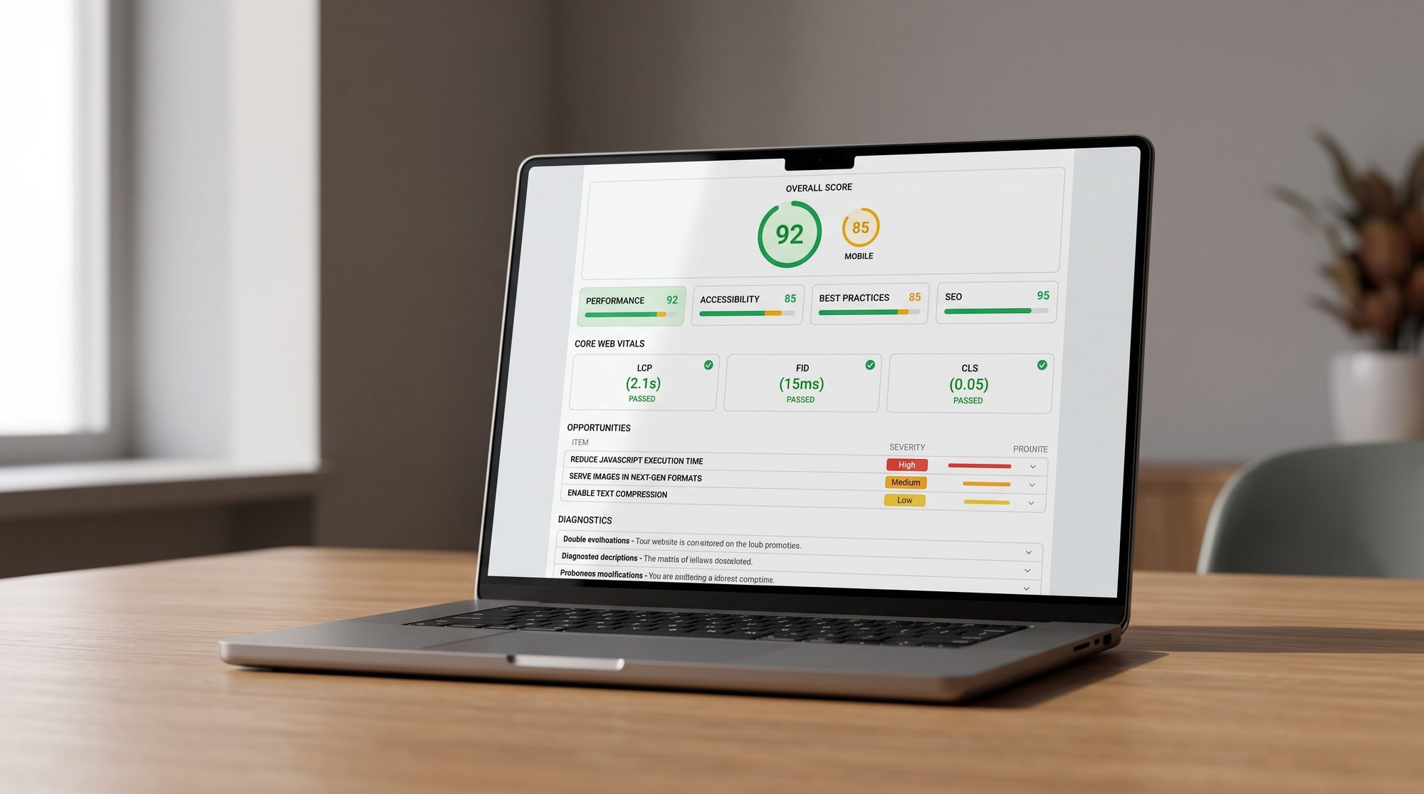
Research from Google shows that pages loading in one second convert at roughly three times the rate of pages that take five seconds to load. Every additional second costs you conversions. Test your page at PageSpeed Insights (a free tool). Compress images, remove unused scripts, and choose a fast hosting setup. A slow page is a leaky bucket: optimization work drains away before the visitor reaches your content.
7. Mobile Experience
More than half of web traffic now arrives from mobile devices. A page that does not work well on a small screen loses those visitors before they even engage with your offer. Check your page on an actual phone, not just a browser window resized on your desktop. Test whether the form submits correctly and whether the CTA button is easy to tap with a thumb.
Why Visitors Hesitate: Answer Objections on the Page
A visitor who does not convert usually has an unanswered question. Common objections include: How much does this cost? How long will the project take? What if I am not happy with the result? Do you have experience with businesses like mine?
You do not need to answer every possible question. You need to answer the ones that come up most often. Talk to recent clients, review your sales email threads, or ask your team what prospects typically ask before deciding. The patterns will become clear quickly.
An FAQ section, a pricing range, or a simple guarantee ("We revise until you are satisfied") removes enough hesitation to tip the balance for visitors who are already interested. Write this content based on real conversations, not assumptions.
Understanding the full picture of how a website converts visitors into clients gives you a useful frame here. How a website systematically wins new customers covers the broader conversion strategy behind this.
A/B Testing: When It Is Worth the Effort
An A/B test, also called a split test, shows two versions of a page to different visitor groups at the same time. Half of visitors see Version A, half see Version B. After enough data has accumulated, you can see which version produces more conversions.
The important caveat: A/B tests require sufficient traffic to produce statistically reliable results. A page that receives 200 visits per month will need many months to accumulate meaningful data for a single test. Testing a low-traffic page produces noise, not insight.
A practical rule: aim for at least 1,000 visits per page per month before investing time in formal split testing. Below that threshold, focus on fixing obvious problems first. The gains from correcting a broken form or an unclear headline are often larger than any A/B test result anyway.
What to Do When You Have Low Traffic
If your page does not yet receive enough traffic for reliable A/B testing, you still have useful options that do not require large data sets.
Session recordings and heatmaps: Tools such as Microsoft Clarity (free) or Hotjar record anonymized visitor sessions and generate click heatmaps. You can see exactly where people stop scrolling, what they click on, and where they leave the page. This qualitative data reveals problems that aggregate numbers cannot show.
GA4 drop-off analysis: In GA4, trace the visitor path from your landing page to the confirmation page. Where do people leave? A large drop between the hero section and the form often points to a clarity problem in the middle of the page.
Five-second test: Show your landing page to someone unfamiliar with your business for five seconds, then hide it. Ask them: what does this page offer? If they cannot answer, your above-the-fold message needs work.
Fix obvious errors first: Check for broken links, form fields that do not submit correctly on mobile, images that fail to load, and phone numbers that are not click-to-call. These basic problems cost conversions without any testing required to identify them.
Spending budget on paid traffic to a page that does not convert is counterproductive. If you are weighing up ads alongside optimization, understanding what Google Ads actually costs helps you prioritize where to put your time and money first.
Landing Page Optimization Checklist
Use this checklist before and after any optimization work:
- One clear primary goal defined for the page
- Headline names the specific problem and the target audience
- Single CTA, repeated consistently throughout the page
- Above-the-fold area shows offer, audience, and next step
- Social proof is placed near the CTA, not just at the bottom
- Contact form contains only essential fields
- Page loads in under 3 seconds, tested on a real mobile device
- Form submits correctly and CTA is easy to tap on mobile
- The most common objections are answered on the page
- GA4 event tracking is active for the conversion goal
- Baseline conversion rate noted with a start date
If your existing page has structural limitations that make iteration difficult, or if you want a landing page built specifically for conversion from the start, having a professional landing page created is often a more effective use of resources than continuing to patch a page that was never designed to convert.




















rev%20komprimiert.jpg)
.jpg)

.png)





.jpg)
.jpg)


